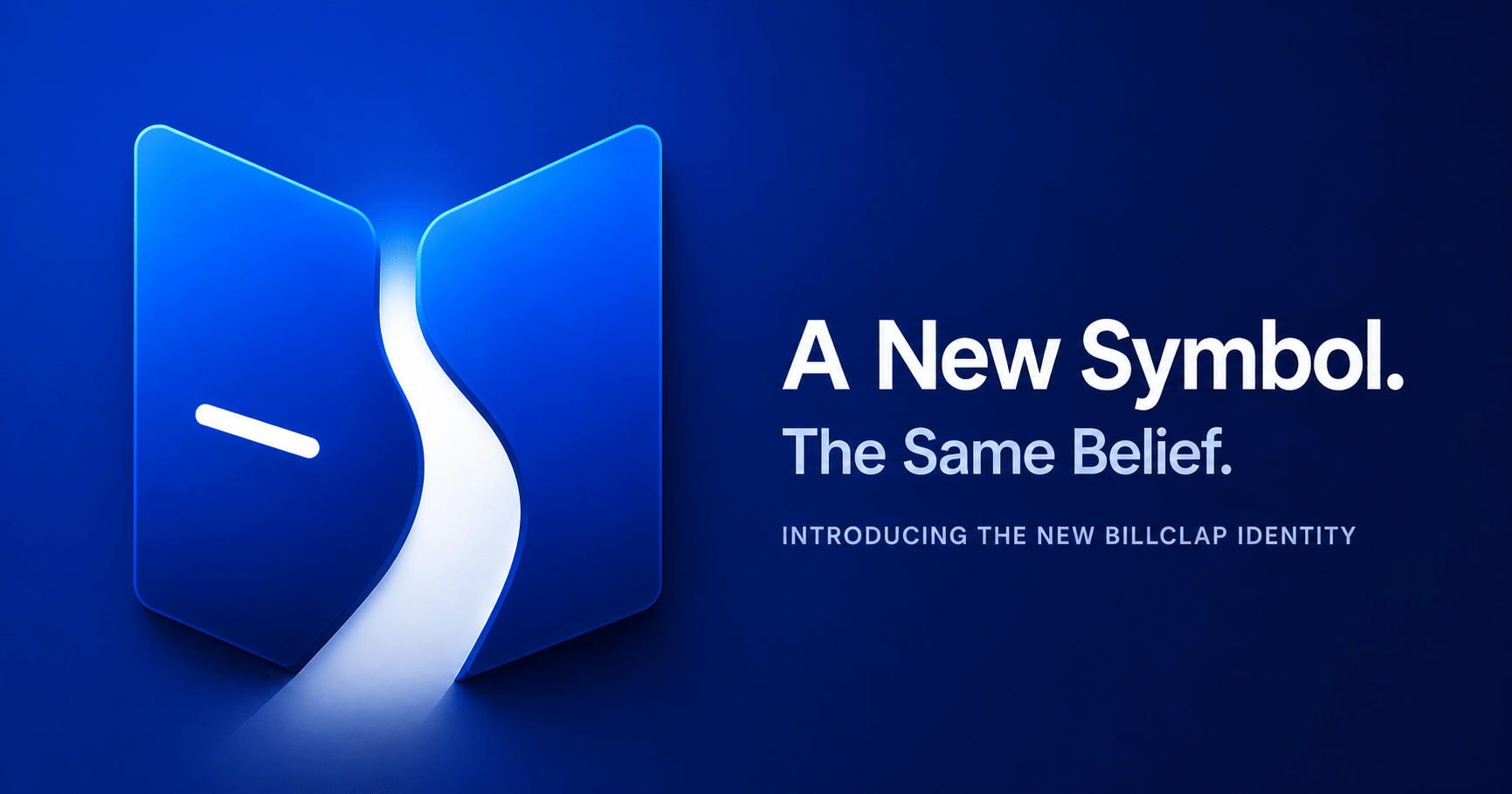
BillClap New Logo: Why We Redesigned Our Identity
The Logo Was Never the Point. The Record Was.
A few months ago, one of our designers asked me a question I didn't have a quick answer to.
"What does BillClap actually look like, when you strip away the product screens and the dashboards? If you had to draw it as one shape — what would it be?"
I sat with that question longer than I expected to.
Five years ago, when we built the first version of BillClap, we didn't have the luxury of asking it. We had a logo because every company needs one. Blue, dependable, a red dot above the 'i' that made it ours. It did its job. It looked like a billing app, because that's exactly what we were.
But a company's logo is supposed to be a promise made visible. And somewhere between our first invoice and our 125,000th business, the promise we were making had quietly outgrown the shape we'd given it.
This is the story of why we changed it.

What a Logo Is Actually Supposed to Do
A logo isn't there to look modern. Looking modern is the easy part — any designer with a good eye and a trend report can make something look current for eighteen months.
A logo is supposed to communicate what a company believes. Not what it sells. What it believes.
For a long time, we believed BillClap was a billing tool. A fast, affordable way for a shop owner to stop writing receipts by hand. And we built the old identity around that belief — it represented exactly the company we were in 2020. A small, focused product, solving one painful problem for one kind of business.
That logo served us honestly. It was never wrong. It simply belonged to a different stage of our journey — the stage where we were still learning what Indian businesses actually needed, one support call and one feature request at a time.
What changed wasn't our ambition. It was our understanding.
Years of Conversations We Didn't Expect to Have
If you'd told us in 2020 that we'd spend the next several years talking to kirana store owners about the fear of a GST notice, to wholesalers about the anxiety of missing an e-way bill deadline, to freelancers about the quiet embarrassment of chasing a client for payment — we'd have believed you. That part we expected.
What we didn't expect was how similar the underlying story would be, no matter who we spoke to.
A pharmacist in a tier-2 town. A textile wholesaler managing forty parties. A freelance designer sending her first GST-compliant invoice to a corporate client. A two-person startup trying to look investor-ready before they'd hired an accountant. Different businesses, different scales, completely different days — and almost the same sentence, in almost every conversation:
"I just want to feel like I'm on top of this."
Not excited. Not impressed. On top of it. In control. Not anxious about what they might be missing.
That's not a billing problem. That's a trust problem. And once we understood that, we couldn't keep representing ourselves with a mark that only spoke to the billing part.
We spent months exploring what would actually speak to the rest of it. We rejected dozens of concepts — clever ones, trendy ones, ones that looked good on a deck but said nothing true about what we'd learned. We debated every line, every curve, every angle, sometimes over a single degree of a curve, because by that point we'd stopped designing a logo and started trying to draw a belief.
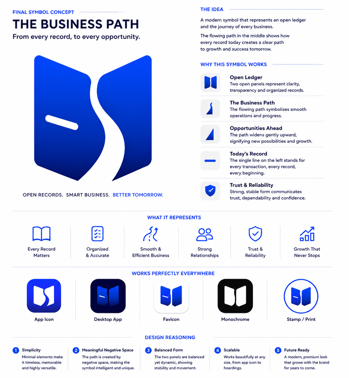
The Symbol We Landed On
The final mark is built from two open panels that resemble a ledger, opened flat. Between them, a path — not drawn, but formed entirely from the negative space where the two panels meet.
That distinction matters more than it might seem to. We didn't draw the path. We let it appear in the space we left behind. Great design, we kept relearning during this process, often says more with what it removes than what it adds. The path isn't decoration sitting on top of the symbol. It's the absence that the symbol creates — which felt right, because that's closer to how most business growth actually happens. Not as something added on top of a business, but as something that emerges from the discipline of what's already there: the records, kept consistently, over time.
The path begins narrow on the left and widens as it moves upward. That's not an abstract growth metaphor we bolted on afterward — it's the literal shape of how every business we've ever worked with has actually grown. Nobody we've spoken to scaled in one leap. They scaled one invoice, one customer, one stock update, one filed return at a time. Each record is small on its own. Stacked together, over months and years, they become a business that can stand on its own.
That's the part outsiders rarely see. From the outside, growth looks sudden — a shop that "made it," a wholesaler who "scaled up." From the inside, it's never sudden. It's a thousand small, careful actions that nobody but the owner ever notices.
We wanted a symbol that respected that truth instead of glamorizing it.
The Open Ledger
Two panels, open and facing each other. This is the part of the mark that speaks to the oldest job we do: keeping clear, accurate, honest records. Transparency. Organization. The kind of clarity that lets an owner sleep at night because they know exactly where their business stands. Before there's a path to growth, there has to be a record worth trusting. The ledger comes first, structurally and philosophically.
The Path
The flowing line between the panels represents movement — the business's actual journey, not a static state. It signals confidence and direction without ever needing to say either word out loud. We chose to build it from negative space rather than draw it directly because we wanted the symbol to ask something of the viewer, the same way a well-built product asks something of its user: pay a little attention, and it gives you back more than it shows on the surface.
Growing Wider
The path doesn't stay one width. It opens up as it rises, because that's how opportunity actually behaves for a business that keeps its records straight. The wider the path gets, the more room there is to move — more credit available, more compliance handled without panic, more time freed up to actually run the business instead of defending it. Growth, in our experience, rarely feels like a single dramatic moment. It feels like more room appearing, gradually, because the foundation underneath was built properly.
The Small Stroke
On the left side of the mark sits a small, deliberate horizontal stroke. It's easy to miss, and that's intentional.
It represents the first record. One bill. One invoice. One transaction, entered by someone who had no idea yet whether their business would work.
Every company we've ever onboarded — the wholesaler now running forty parties, the startup now hiring its tenth employee — started exactly there. One entry. One small act of believing the business was worth recording properly. We wanted that beginning permanently present in our own mark, not as nostalgia, but as a reminder of who the symbol is actually for.
Strong, Stable Geometry
We were careful not to let the mark feel flashy. Business software shouldn't try to excite anyone. It should earn trust, quietly, by being reliable in the exact moment it's needed — at month-end, at filing deadline, at 11pm when a shop owner is closing out the day's sales. So the panels are bold and grounded, not delicate. The forms are stable, not decorative. If the mark has a personality, it's the personality of something you can lean on.
Why We Chose Simplicity Over Spectacle
It would have been easy to design something more elaborate. More color, more detail, more "concept." We didn't, on purpose.
The strongest brand marks in the world tend to be the simplest ones — not because simplicity is trendy, but because it's durable. A simple symbol scales from a 16-pixel favicon to a building-side hoarding without losing meaning. It survives being printed in a single color on a thermal receipt. It still reads clearly on a cracked phone screen in a kirana store with patchy lighting, which, for a product like ours, is not a hypothetical — it's a Tuesday.
We wanted a mark that would still feel honest ten years from now, long after this particular design trend has aged out of fashion. Simplicity was the only way to get there.
On the Old Logo
We want to be precise about this part, because it matters to us: the old BillClap logo did nothing wrong. It carried us through our earliest and arguably hardest years — the years of figuring out, often the hard way, what Indian SMBs actually needed versus what we assumed they needed. It represented a real and important chapter, and we're not interested in pretending otherwise just to make the new mark look better by comparison.
It simply belonged to a different stage of our journey. The new identity doesn't replace it so much as it reflects where the company is heading, built on everything that earlier stage taught us.
Becoming More Than Billing Software
There's a reason this redesign comes now, and not three years ago when an agency first pitched us a refresh.
We weren't ready then. We were still, fundamentally, a billing tool with some accounting features bolted on. The old mark fit that company precisely.
The company we are today is different. GST billing was the front door, but what businesses actually use BillClap for now stretches well beyond it — inventory that tracks itself, a digital storefront that takes orders with zero commission, automated WhatsApp communication, multi-user access as teams grow, e-invoicing that just works on deadline day. Increasingly, BillClap isn't the tool a business uses to create one document. It's becoming the place a business runs from.
We don't say that to sound grander than we are. We say it because it's the honest description of what we've watched happen, account after account, over the last two years. And a logo that only spoke to "billing" couldn't honestly represent a company that businesses now trust with considerably more than that.
The new symbol doesn't promise we've arrived somewhere final. It promises we understand the direction, and that the direction is set by what businesses actually need from us — not by what would look impressive in a pitch deck.
What This Is Really About
Here's the thing we kept returning to, every time the redesign process got complicated: this was never really about us.
Every successful business begins with a single record. A single customer. A single invoice raised with shaking hands, not knowing if anyone would pay it. A single leap of faith that this — this small shop, this freelance gig, this two-person idea — might become something real.
Our new symbol is built to honor that beginning. Not just ours. Yours.
We started as one small leap too — a handful of people who believed Indian businesses deserved software that didn't talk down to them, didn't cost more than the business could justify, and didn't disappear the moment something went wrong with a GST filing. Every business that has trusted us with their first invoice since then has been part of writing this story alongside us, whether they knew it or not.
This isn't just a new logo.
It's a promise. A promise that we'll keep building the kind of products that help a business move from today's record to tomorrow's opportunity — narrow path widening, one entry at a time, for as long as you keep showing up to write the next one.
We're glad you're here for this chapter.
— The BillClap Team
Frequently Asked Questions
Why did BillClap change its logo?
The redesign reflects how much the company itself has changed. BillClap began as a focused GST billing tool, but has since grown into a broader business management platform covering inventory, e-commerce, WhatsApp automation, and compliance. The new identity was built to honestly represent that wider scope.
What does the new BillClap symbol represent?
The symbol shows two open panels forming a ledger, with a path running between them created through negative space. It represents transparency, the journey of every business record, and the idea that growth happens one transaction at a time rather than in sudden leaps.
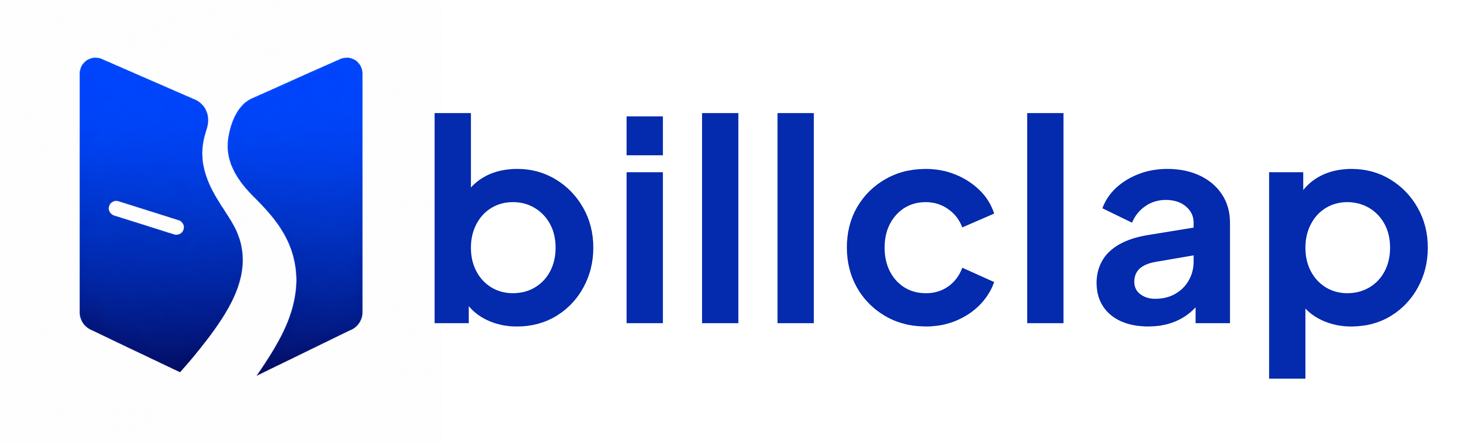
Is the BillClap brand name changing?
No. The wordmark, the brand name, and the signature red dot remain part of the identity. What's changing is the addition of a symbol — a visual mark — alongside the existing logo, designed to work across app icons, favicons, and print where a wordmark alone doesn't scale well.
Will the old BillClap logo still be used anywhere?
The previous logo will be phased out across BillClap's digital and print touchpoints as the new identity rolls out. It remains part of the company's history and isn't being discarded with any negativity — it simply belongs to an earlier chapter.
Does this redesign affect the BillClap product or pricing?
No. This is a brand identity update only. BillClap's billing, accounting, inventory, GST compliance, and Digital Dukaan features continue exactly as they are, with no changes to plans or pricing as a result of this update.
Thousands of Indian businesses already made the switch. Join them and simplify your billing, accounting, and GST filing with BillClap. Try BillClap free — no credit card needed.

